Interior Color Psychology: Designing for Mood & Mind
Embark on a journey into Interior Color Psychology: Designing for Mood & Mind, where the power of colors in shaping our emotions and thoughts is unraveled.
Delve deeper into the world of color psychology and how it influences the ambiance of our living spaces.
Importance of Interior Color Psychology

Color psychology plays a crucial role in interior design as it has the power to influence our mood, emotions, and overall well-being. The choice of colors in a space can impact how we feel, think, and behave, making it essential to consider the psychological effects of different colors when designing interiors.
Effect of Colors on Mood and Mindset
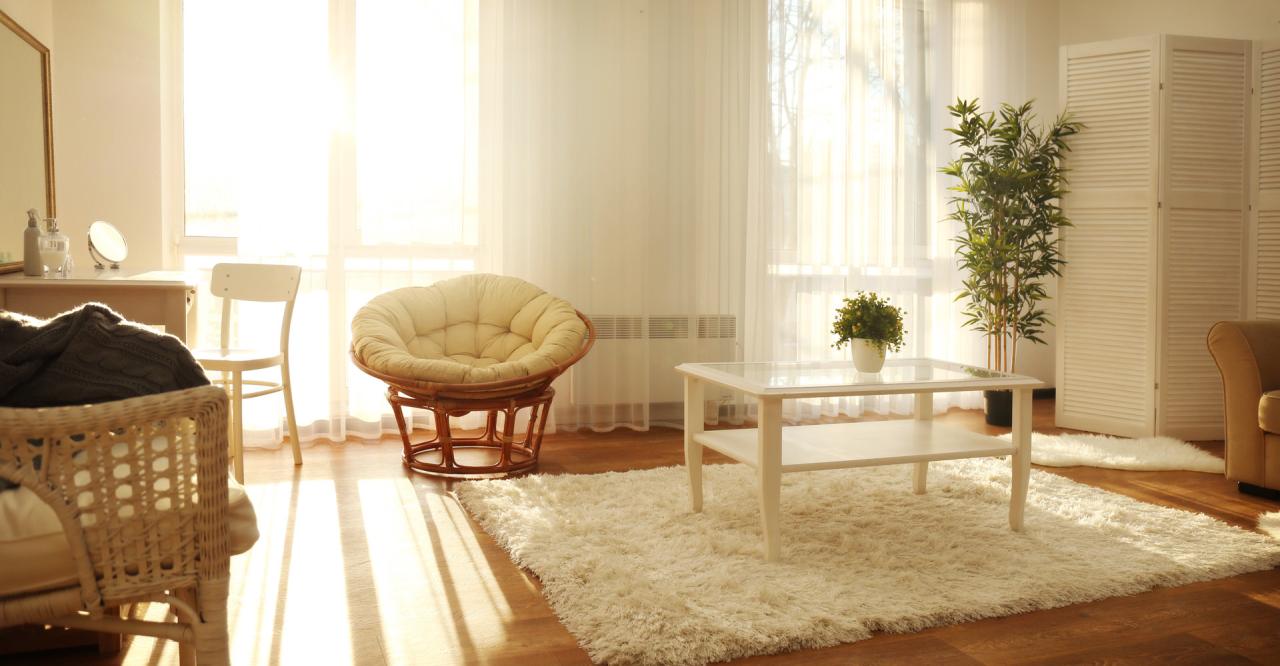
- Warm colors like red, orange, and yellow are known to evoke feelings of energy, warmth, and positivity. They can stimulate conversation and create an inviting atmosphere in social areas like living rooms or dining spaces.
- Cool colors such as blue, green, and purple are calming and soothing, promoting relaxation and concentration. These colors are ideal for bedrooms, offices, or areas where a sense of tranquility is desired.
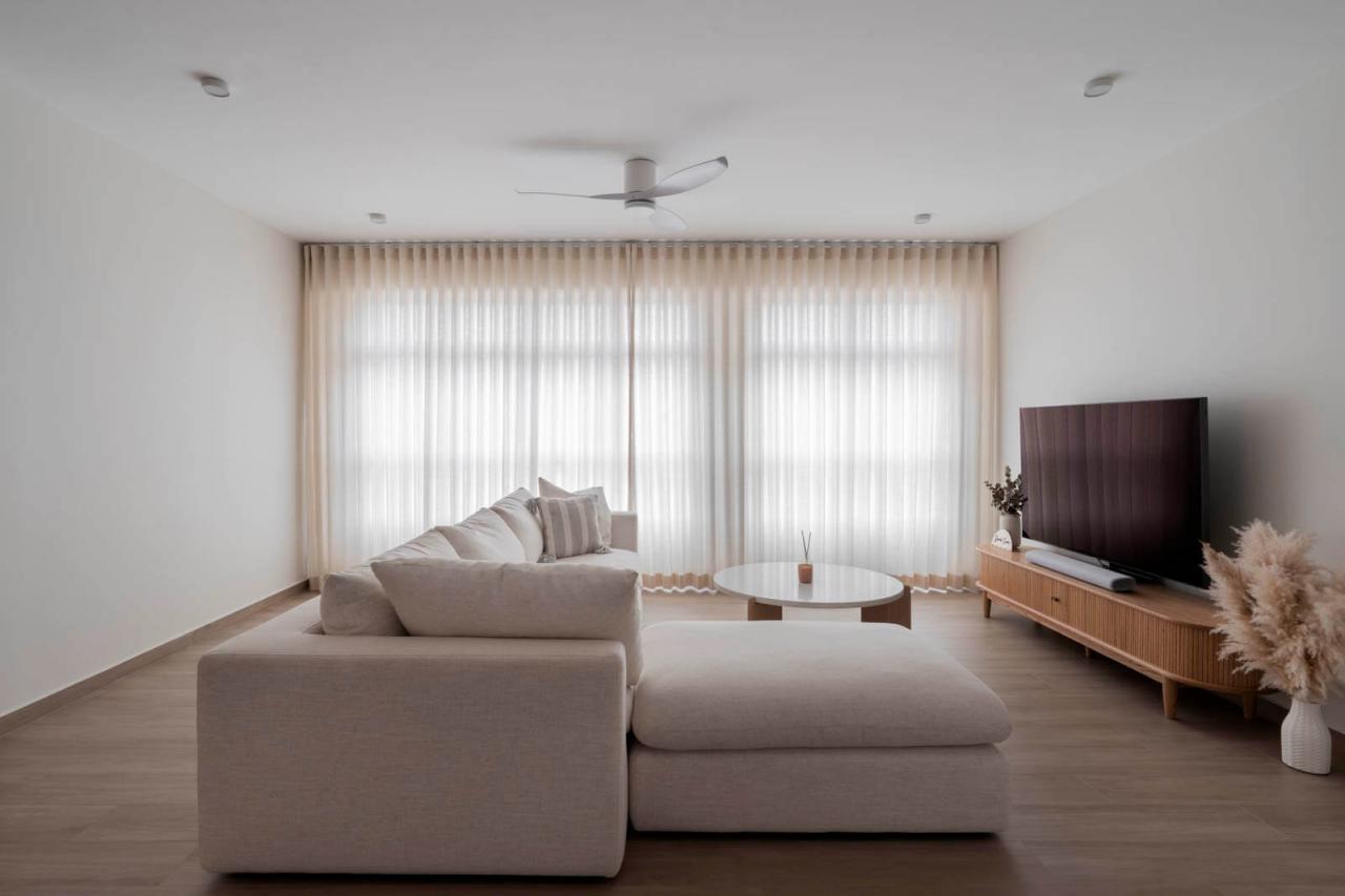
- Neutral colors like white, beige, and gray are versatile and can create a sense of balance and simplicity. They provide a backdrop for other elements in the room to stand out and can help create a sense of spaciousness.
Creating Specific Atmospheres with Color
- For a cozy and intimate space, consider using warm tones like deep reds or earthy browns to create a sense of comfort and security.
- To add a touch of sophistication and elegance, opt for darker shades like navy blue or charcoal gray, which can convey a sense of luxury and refinement.
- If you want to promote creativity and inspiration, vibrant colors like bright yellow or orange can stimulate the mind and foster a dynamic environment in work or creative spaces.
Understanding Color Associations
Color associations play a crucial role in interior design, as different colors can evoke various emotions and moods. Understanding these associations is key to creating spaces that resonate with individuals on a psychological level.Warm colors such as reds, oranges, and yellows are known to elicit feelings of energy, warmth, and excitement.
They can create a cozy and inviting atmosphere, making them ideal for social spaces like living rooms or dining areas. On the other hand, cool colors like blues, greens, and purples tend to have a calming and soothing effect. They are often used in bedrooms or offices to promote relaxation and focus.Cultural influences also play a significant role in color perceptions and preferences.
For example, in Western cultures, white is often associated with purity and cleanliness, while in some Eastern cultures, it symbolizes mourning and death. It is essential to consider these cultural nuances when designing spaces to ensure that the chosen color schemes resonate positively with the occupants.
Applying Color Psychology in Design
When it comes to designing interiors with color psychology in mind, it's essential to consider the desired outcomes you want to achieve. Here are some strategies for selecting colors based on different moods and purposes:
Choosing Colors for Specific Outcomes
- Create a productive environment by using shades of blue or green, known to improve focus and concentration.
- For relaxation and tranquility, opt for soft hues like lavender, light blue, or pale pink.
- To stimulate creativity and inspiration, incorporate shades of yellow or orange in your design.
Combining Colors for Harmony
When combining colors in interior design, it's crucial to create a balanced and harmonious look. Some tips for achieving this include:
- Stick to a color palette of 3-5 shades to avoid overwhelming the space.
- Use the 60-30-10 rule: 60% dominant color, 30% secondary color, and 10% accent color for a well-balanced design.
- Consider the color wheel and choose complementary or analogous colors for a cohesive look.
Enhancing with Accent Colors
Accent colors play a vital role in interior design by drawing attention to specific areas or features in a room. Here are some ways to effectively use accent colors:
- Highlight architectural details or focal points with a bold accent color to make them stand out.
- Add pops of accent color through accessories like throw pillows, rugs, or artwork for visual interest.
- Use accent colors sparingly to prevent visual clutter and maintain a cohesive overall look.
Trends in Color Psychology for Interior Design
Color trends in interior design play a crucial role in creating the desired atmosphere and mood in different spaces. Let's explore how color choices for various room types have evolved over time and the impact of technology and social media on these trends.
Living Rooms
- Neutral tones such as beige, gray, and white are popular choices for living rooms as they create a calming and inviting environment.
- Accent colors like navy blue, emerald green, and mustard yellow are being used to add a touch of sophistication and personality to the space.
- Color blocking techniques with bold and contrasting hues are gaining popularity to create a modern and dynamic look.
Bedrooms
- Soft pastel shades like blush pink, lavender, and sky blue are commonly used in bedrooms to promote relaxation and restful sleep.
- Earthy tones such as terracotta, olive green, and warm browns are trending for a cozy and grounding feel in modern bedroom designs.
- Muted shades of blue and green are being incorporated to evoke a sense of serenity and tranquility in the bedroom space.
Offices
- Shades of blue, such as navy and teal, are popular choices for office spaces as they are known to enhance productivity and focus.
- Neutral colors like gray and taupe are often used in office design to create a professional and sophisticated atmosphere.
- Pop of vibrant colors like red, orange, or yellow are being introduced in office interiors to stimulate creativity and energy.
Evolution of Color Trends
Color trends in interior design have evolved from traditional and safe choices to more daring and experimental combinations. With the influence of social media platforms like Pinterest and Instagram, there is a greater emphasis on unique color palettes and personalized design aesthetics.
Impact of Technology and Social Media
Technology and social media have played a significant role in shaping color preferences in interior design. With the rise of virtual design tools and online inspiration boards, homeowners and designers have access to a wide range of color schemes and trends, leading to more creativity and diversity in color choices.
Final Summary
As we conclude our exploration of Interior Color Psychology: Designing for Mood & Mind, remember that the palette you choose can truly transform the way you experience your surroundings.
FAQ Resource
How does color psychology impact our daily lives?
Color psychology influences our emotions, behaviors, and overall well-being, making it essential in interior design for creating desired atmospheres.
Can color choices affect productivity in a workspace?
Absolutely! Colors like blue and green can promote focus and efficiency, while reds and yellows can enhance creativity and energy levels.
Are there specific cultural differences in color perceptions?
Yes, cultural backgrounds can influence how people perceive and respond to colors, which is important to consider in a multicultural society.